XDMoD
XDMoD - XSEDE Metrics on Demand - is an NSF-funded open source tool designed to audit and facilitate the utilization of the XSEDE cyberinfrastructure by providing a wide range of metrics on XSEDE resources, including resource utilization, resource performance, and impact on scholarship and research. While initially focused on the XSEDE program, Open XDMoD, xdmod.sourceforge.net, has been created to be adaptable to any HPC environment.
Update (3/23/20):
CHPC has updated XDMoD to the latest version and has also implemented the SUPReMM (Systems Usage and Performance of Resources Monitoring and Modeling) module as well as deployed a second instance to track usage of the protected environment (PE).
The documentation on this page has been updatedwith additional informationon ways to make use of the new options. For more information, please see the XDMoD User Manual, https://xdmod.ccr.buffalo.edu/user_manual/. Note that CHPC is still working on implementation some of the features of the program.
Use of CHPC's XDMoD Installation
On the front page of either site you are provided with summary information for the CHPC clusters. By default, you will see the previous month’s usage, but you can change the timeframe being reported by either the pulldown menu or by changing the start and end date and then refresh. This view provides statistics on the number of users running batch jobs and the number of groups to which they belong, the number of jobs, the total number of CPU time (core hours), and the average wait time.
As before, from the Usage tab you are able to delve deeper into the usage. Here is one example of information you can get
Example 1: How to get a group usage broken down into per user level.
On the Usage page, select the time frame of interest. On the left hand side there are a number of metric choices; in this panel select “Jobs by PI” and expand the menu. Expanding the "Jobs by PI" results in a new set of choices, including “CPU Hours:Total”. On the same level as the time frame choices there is a filter – open this and select your group. This will give you single entry for the group
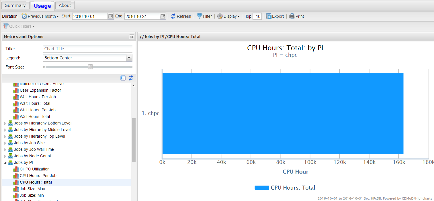
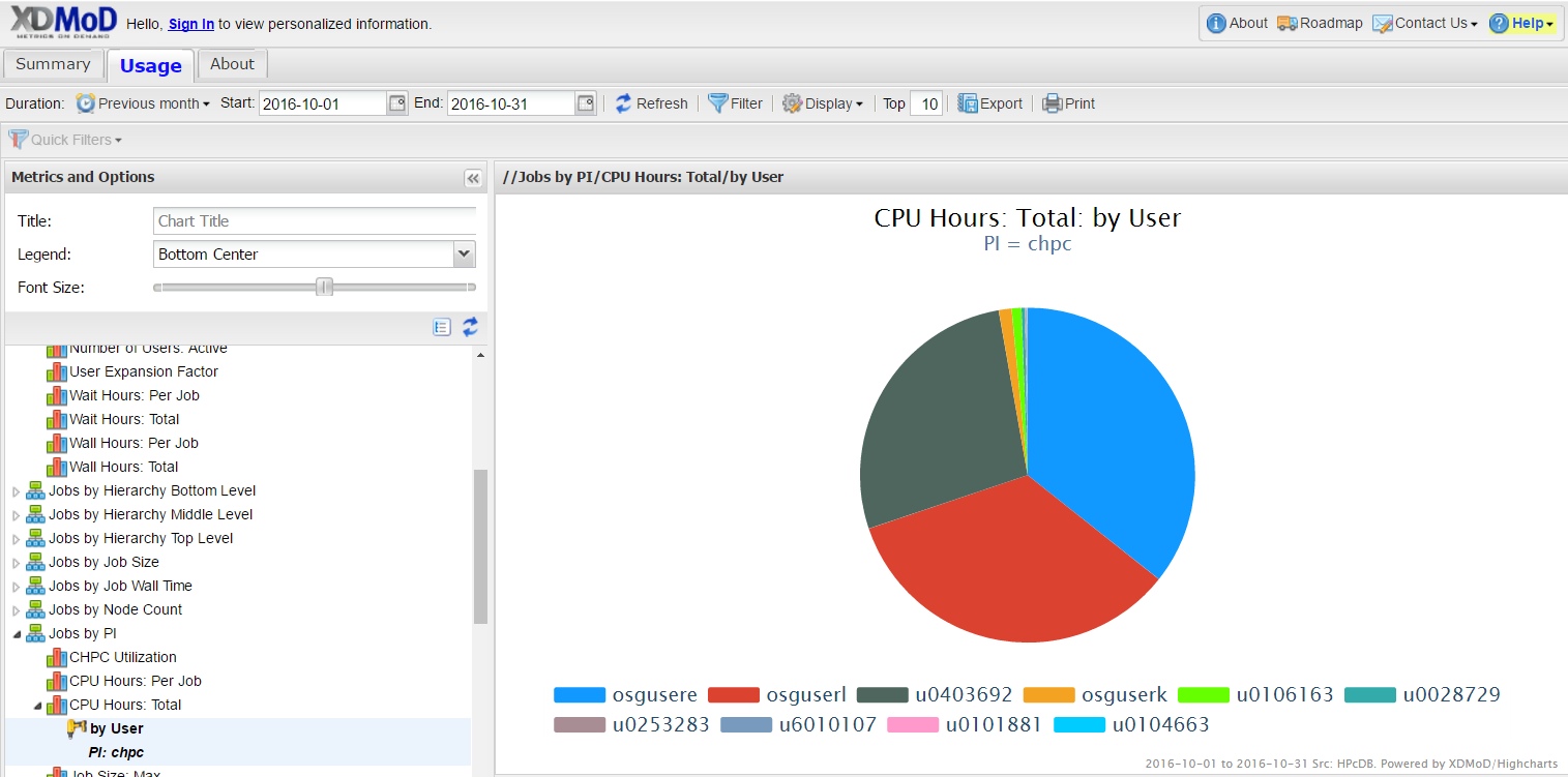
Then on the blue bar – left click and select drill down by user. By the filter these are display choices – you can do a pie chart, a bar graph etc., as well as plotting this data as a time series of different steps. Note that you can also export the data as a figure or a CSV file which excel can read.
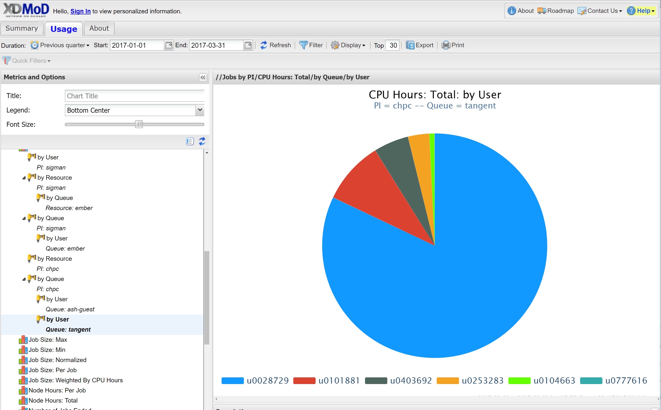
If instead of selecting drill down by user, you can select drill by by resources and get a diagram or spreadsheet that gives the usage based on which cluster (kingspeak, ember, lonepeak, ash.tangent), or select drill down by queue and see usage in terms of queue (kingspeak, kingspeak-guest, owner partitions, etc). You can also do multiple drill downs, for example first by queue and then by user to get a result such as:
Added 3/23/2020: While you can continue to get the more detailed information as described above, with the upgrade you can instead use the personalized dashboard feature - which can also be customized. This will also allow you to always see the results without redoing the steps above.
Customized Dashboard
We have now enabled login to the XDMoD instances, which allow you to access a more personalized dashboard that you can be customized. The first step is to sign in using your University login credentials. By default your role is that of a user, and you will give you the current standard user dashboard, which includes a list of your recent jobs (last month), a chart of the usage of these jobs (both number of jobs and core hours used), the wait time of each queue, and a job efficiency meter, shown in Figure 1.
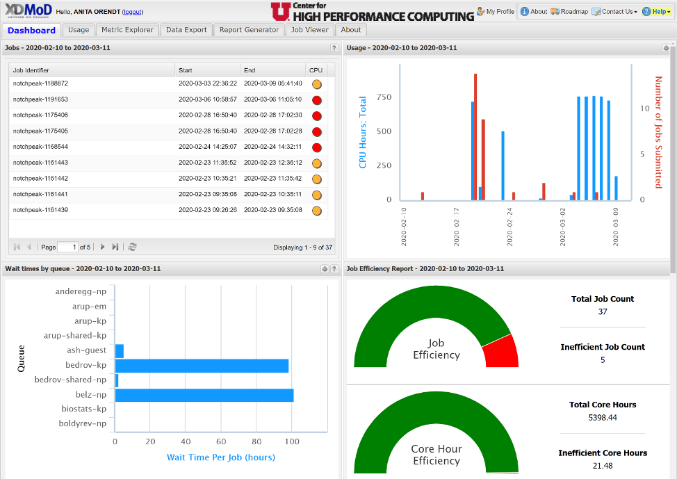
By default the time period is the last 30 days. If you move the cursor over the different sections, you will see additional information. Also note that there is a different metric used in the CPU efficiency in the job listing – a scale of red, orange, yellow, green or N/A (N/A is for jobs that were deleted before they started) - whereas in the Job Efficiency report, jobs are marked "inefficient"/red if they have less than 10% User CPU usage AND they are using less than 50% of available memory. Also note that the way hyperthreading is treated in XDMoD, an efficiency of 50% is all cores assigned to the job being used.
If you go to your profile, you will see your current role. As mentioned above the default role assignment is user. There is, however, a PI role that will show not only your own usage, but the usage of all members of your group. In order to be given access to this you can send a request to helpdesk@chpc.utah.edu. Note that CHPC will require anyone that is given this role to be a CHPC PI or have the PI’s permission.
If an existing chart in the Dashboard view has the “Edit in Metric Explorer” icon
(![]() ) in the title bar you can use this icon to change or customize the chart. Alternately,
you can add additional charts to your personal dashboard by selecting the “Metric
Explorer” tab. Below we will give examples of both.
) in the title bar you can use this icon to change or customize the chart. Alternately,
you can add additional charts to your personal dashboard by selecting the “Metric
Explorer” tab. Below we will give examples of both.
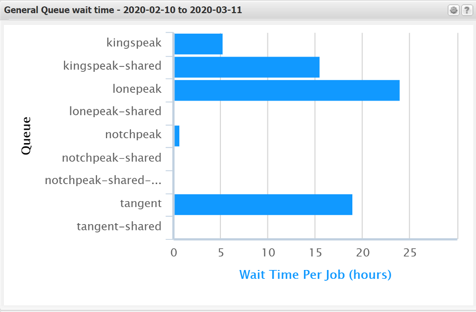
Editing an existing chart: The default “Wait times by queue” chart is not useful as it only shows the first 10 queues from an alphabetical order listing of all queues. Showing the wait time for the queues to which you have access may be of more user. Once you click on the icon mentioned above, you will see the chart in the Metric Explorer tab. There is the option to “Add Filter” – in this case we would select the Queue option and select the queues of interest. As we have many queues, typing the name in at the search is the easiest option. You might want to select the queues you commonly use, such as the general ones, keeping in mind that the chart will only show ten. If you have more than ten, you may want to set up multiple charts, say for the general, gpu and owner queues.
In this example we will look at the general queues of the clusters. For the general queues, you may want to choose granite, notchpeak, notchpeak-shared-short, kingspeak, and lonepeak. Select these from the Add Filter and then click OK. You can then save the changes, and under the chart title pull down on the left, perhaps change the title. This results in the chart changing to:
Create a New Chart:To start a new chart, there are two options. You can modify an existing, but instead of doing Save, do Save As, and give it a new name. This works well if the changes are not extensive. However if you want a chart that is different from the ones that already exist, it is easiest to start a new chart. Once you have the chart you want, be sure to Save, and then also make sure that the “show in Summary Tab” option is selected in the pull down for the chart found on the right hand side.
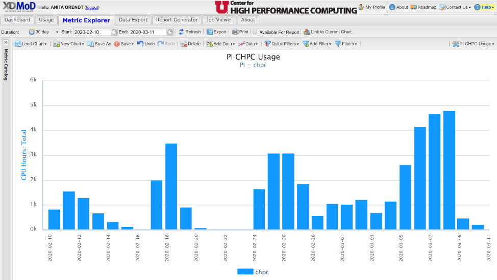
As an example, we can look at creating a chart that shows the timeseries usage of a slurm account (PI) by user on the resources to which they have access. Selecting “New Chart”, give it a title and select they type of chart (say timeseries, bar). Open up the “Metric Catalog” on the left hand side to choose the metric, in this case under jobs you will find an option for total CPU hours; left click on the category will give you the filters that allow you to choose by PI. Then using the Add Filter by PI, choose the appropriate group. This gives you a daily aggregate for the group.
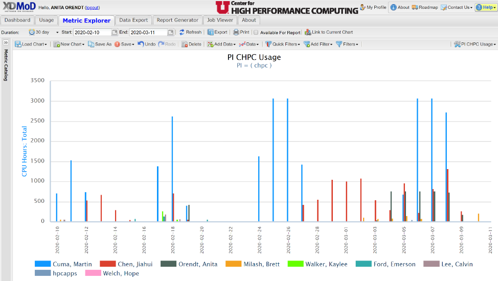
To break this down to per user, use the “Drill Down” feature, by left clicking on one of the bars, selecting drill down, then by user. This results in the view below:
Once you have the chart you want, be sure to save or save as, and then also make sure that the “show in Summary Tab” option is selected in the pull down for the chart found on the right hand side. The chart will then be on your personal dashboard, and it will automatically update the timeframe.
This is just one example of the type of charts possible. The XDMoD User Manual, https://xdmod.ccr.buffalo.edu/user_manual/, provides additional, detailed information about the options.
Addition of the SUPReMM module
The SUPReMM (Systems Usage and Performance of Resources Monitoring and Modeling) module is also referred to as the Job Performance Module. The information about a job is pulled from the slurm and the Performance Co-Pilot (PCP) monitoring we have running on all compute nodes. Note that we have imported all of the existing slurm data into XDMoD (since June 2015 in the general and February 2018 in the protected environemnt) ; PCP data exists since June 2019.
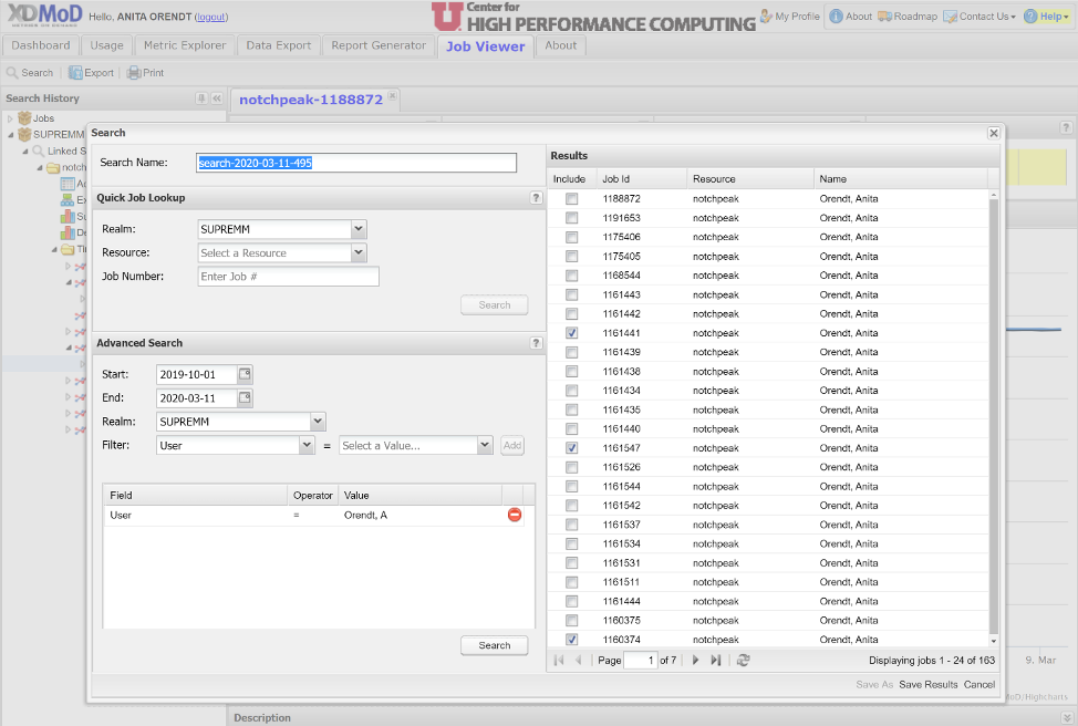
There are two main ways to access this information about a given job. The first is to select the jobs from the jobs listing on the personalized dashboard mentioned above; this will pull the job information and open the Job Viewer Tab. The second way is to select the "Job Viewer" tab, and use the "Search" tab to choose the job or jobs you want to analyze, either via the quick lookup if you have the cluster and job number, or via the advanced search which will give you a list of jobs. Note that in the advanced search you can choose any date range; when you choose the filter, it will populate a pulldown of options available in the “Select a Value” field. Once this is populated, click the “Add” button, and then the “Search” button near the bottom. If there are any jobs that match the selected criteria, they will appear in the “Results window. Form the jobs that appear, you can select one or more by checking them in the “Include” column, then “Save Results” at the bottom. This is shown below.
When you do either one of these, you will see the selected job(s) in the Job Viewer Tab, as shown below:
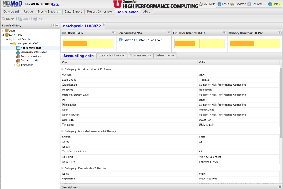
In the Job Viewer window, there are four tabs:
- Accounting data: information about the job, such as its run time and the executable used
- Executable information: includes the node(s) and the cores assigned to the job
- Summary metrics: information about cpu, memory, file and network I/O, and energy usage
- Detailed metrics: increased granularity of data in Summary metrics tab
There is also the option to get plots of timeseries data on a number of the metrics over the course of the job by opening the Timeseries folder found on the left hand side of this window.
If you would like assistance in interpreting this data for any of your jobs, refer to the XDMoD user manual or reach out to CHPC via helpdesk@chpc.utah.edu for assistance.